
Healthcare Website & Mobile App Re-design
Reducing frustration, building trust, and saving lives through human-centered design for expectant parents
Client
Inception Lifebank
Industry
Healthcare
Role
Lead UX Researcher & Designer
Team
UX Researcher (me), Product Owner, Medical Advisor, Compliance Officer, Frontend Developer

89%
Completion Rate
Up from 61% baseline
10 min
Time Saved
From 22 to 12 minutes average
4.7/5
Satisfaction Score
Post-redesign survey rating
2,800+
Fewer Support Calls
In first 2 months post-launch
The Challenge
Insception Lifebank needed to transform their cord blood banking registration process.
Expectant parents were abandoning the digital registration flow, leading to increased customer service calls and missed opportunities for crucial health services.
Expectant parents struggled to complete digital registration for cord blood banking due to confusing medical terminology, lengthy form fields, and unclear process steps
Many abandoned the form entirely and resorted to calling customer service, creating operational backlogs and frustration.
Discovery & Research
To understand the root causes of poor completion rates, I conducted comprehensive user research combining qualitative and quantitative methods

Conducted 15 in-depth interviews with expectant parents across Canada, including both first-time and returning users

Observed live registration calls with customer service agents to identify pain points in real-time

Surveyed 200 recent registrants; 64% described the process as "stressful and unclear"

Identified critical usability issues with information hierarchy, terminology, and error handling
Key Research Insights
Emotional Vulnerability
Users were overwhelmed and emotionally charged due to pregnancy-related stress, requiring empathetic design approaches
Language barriers
Medical and legal terminology created confusion and hesitation, particularly around consent processes
Mobile-first necessity
78% of users accessed the form via smartphones, yet the interface wasn't optimized for mobile
Need for reassurance
Parents sought humanized language, clear visual progress indicators, and transparency about next steps
Competitive Analysis Findings
Analysis of four leading platforms (including Canadian Blood Services and SickKids) revealed that successful healthcare registration experiences prioritize:
-
Strong, consistent visual branding that builds trust
-
Clear calls-to-action with minimal friction
-
Testimonial integration and visual storytelling to create emotional connection
-
Accessible support options, including live chat

Research Work Continued...

User Persona
I developed proto-personas based on initial assumptions and refined them into evidence-based personas as research data accumulated. These personas helped guide design decisions and prioritize features.
Pain Points: Complex medical jargon, unclear registration steps, concerns about data security

Journey Map Insight
Kerry's emotional engagement peaked when encountering heartfelt stories about stem cell storage benefits but dipped significantly during the information-gathering phase. This revealed critical opportunities to:
-
Streamline content delivery
-
Provide empathetic, contextual support
-
Maintain emotional connection throughout the process
-
Offer clear, accessible information at decision points

Empathy Map
Empathy map allowed the team to align the registration flow with users’ feelings and motivations not just their tasks, leading to a more user-centred outcome.
Design Strategy
Based on research insights, I established four core design principles to guide the redesign:
Create a step-based registration flow that acknowledges the emotional journey of expectant parents

Replace medical jargon with clear, accessible language and visual cues for complex concepts

Ensure WCAG 2.1 compliance and mobile-first design for all users

Establish credibility through consistent design, transparent communication, and security reassurance
Design & Iteration
Round 1: Low-Fidelity Testing
Findings: Users were confused by the placement of the consent form and discovered hidden fees late in the process, causing abandonment.
Action: Repositioned consent information earlier in the flow and introduced transparent pricing upfront.
Round 2: Mid-Fidelity Testing
Findings: Users appreciated the visual timeline showing process steps but remained hesitant about data security.
Action: Added security badges, privacy reassurance microcopy, and clear data handling explanations
Round 3: High-Fidelity Testing
Findings: Achieved 92% task completion rate with overwhelmingly positive feedback on flow clarity and empathetic tone.
Action: Minor refinements to spacing and button hierarchy based on user feedback.
I tested and refined testings through three rounds of usability testing.
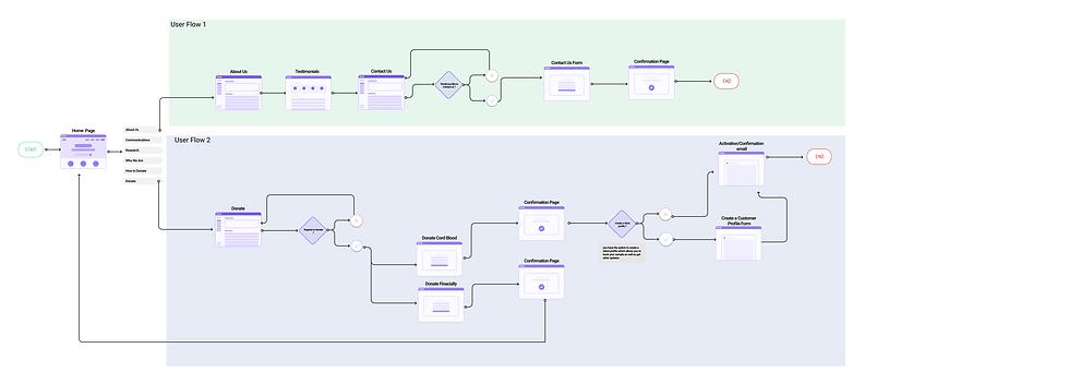
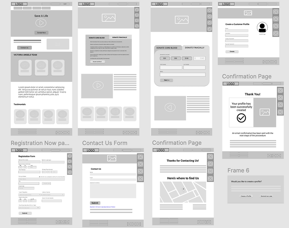
Wireframes
I created Wireframes to bring ideas to design
Mobile

Desktop
Key Design Iterations
-
Replaced medical jargon with plain language (e.g., "Informed consent" became "Your permission to store your baby's cord blood")
-
Added reassuring microcopy and contextual tooltips throughout the experience
-
Implemented mobile-first responsive layout with large touch targets for ease of use
-
Incorporated warm color palette, soft edges, and inclusive imagery to reduce anxiety
-
Created a visual progress indicator to provide transparency and reduce cognitive load
Clickable Prototype
High-fidelity Prototypes used for A/B Testing


Final Solution
Step-by-step guided flow with clear progress indicators and estimated completion time
Plain-language consent forms with expandable help content for complex terms
Mobile-first responsive design optimized for the 78% of users on smartphones
Visual timeline showing what to expect from registration through delivery day
Automated communications including confirmation and reminder emails built into the flow
Contextual support with tooltips, FAQs, and easily accessible customer service
Before


After


Outcomes & Impact
The redesigned registration process delivered significant measurable improvements across all key metrics:
+28%
Completion Rate
Increased from 61% to 89%
-45%
Support Calls
Reduced within first 2 months
-46%
Time on Task
From 22 mins to 12 mins avg
4.7/5
User Satisfaction
Post-redesign Survey Rating
Project Challenges
Legal Compliance vs. Empathy
Balancing required legal language with warm, accessible communication.
Anxiety- Driven Behavior
Designing for users experiencing heightened emotional states during pregnancy
Regulatory Navigation
Adhering to HIPAA-equivalent Canadian healthcare data regulations while maintaining usability
Key Learning
Emotional design is essential in healthcare
Functionality alone isn't enough when users are vulnerable; empathy must be embedded in every interaction
Tone of voice is a powerful UX tool
The right words can reduce anxiety, build trust, and guide users through complex processes
Mobile-first is non-negotiable
Especially for prenatal users managing busy schedules and limited desktop access
Test early and often
Each iteration revealed critical insights that shaped a dramatically better experience